Who is Jim Fowler?
Jim Fowler is a mathematician at The Ohio State University. His research interests broadly include geometry and topology, and more specifically focus on the topology of high-dimensional manifolds and geometric group theory. In other words, he thinks in depth about highly symmetric geometric objects. He's fond of using computational techniques to attack problems in pure mathematics.
Prior to working at The Ohio State University, he received an undergraduate degree from Harvard University and received a Ph.D. from the University of Chicago.
Research
Find a list of my research papers. Read my research statement. My research combines geometric group theory and surgery theory.
Teaching
See my teaching statement, download course materials from past and present courses, or watch some videos. I've taught on Coursera and on iTunes U.
Email me
The best way to contact me is via email: write to me at my last name at math.osu.edu.
You can also call or text me at (773) xxx-5659.
Office hours
My office is in room MW610, in the Math Tower.
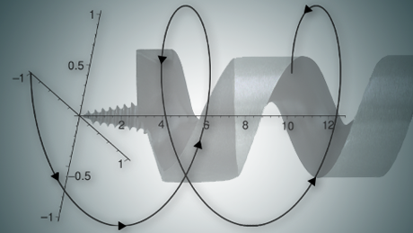
Calculus One
Calculus is about the very large, the very small, and how things change. The surprise is that something seemingly so abstract ends up explaining the real world. Calculus plays a starring role in the biological, physical, and social sciences. This online course is a first and friendly introduction to calculus, suitable for someone who has never seen the subject before, or for someone who has seen some calculus but wants to review the concepts and practice applying those concepts to solve problems.
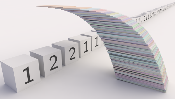
Calculus Two: Sequences and Series
Sequences and Series will challenge us to think very carefully about "infinity." What does it mean to add up an unending list of numbers? How can an infinite task result in a finite answer? These questions lead us to some very deep concepts—but also to some powerful computational tools which are used not only in math but in many quantitative disciplines.
This course is a first introduction to sequences, infinite series, convergence tests, and Taylor series. It is suitable for someone who has seen just a bit of calculus before.