Global Warming according to Google
August 22, 2008 personal
Google Trends plots the search volume (or some other measure? search percentage?) for a given phrase over time. It’s ridiculously fun!
As an example, let’s look at the number of times people search for the words hot and cold. I downloaded the CSV file offered by Google trends to make the following graph:
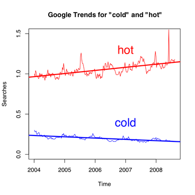
The thick red and blue lines are the linear regressions on the number of searches for hot and cold, respectively. Behold!—people are searching more often for hot lately, and less often as of late for cold! The search volume does seem to be related to the temperature: you might notice that the search volume for cold dips under the regression line during the summer, but exceeds it during the winter.
And so, global warming is being revealed in our search habits. Maybe I should’ve titled this post “Google warming.”